Como’s city council has sought to clarify a case of heraldic confusion. The new mayor, Alessandro Rapinese, on gaining office last year, decided to clarify what must have been the most insignificant of the many issues facing the new administration, – its coat of arms. The local newspaper, La Provincia, on 26th May reported him as saying:
“Since taking office we have been trying to manage the chaos inside the Palace, even in small things. In addition, Wednesday we fixed another disturbing element after discovering that the Municipality of Como actually has more coats of arms and that the statute does not comply with what was approved by the Heraldry office of the Presidency of the Council of Ministers, to whom we have turned for clarity. Como will now have the coat of arms that has been attributed to it and I think we are the only case in the Republic to have modified it”
Alessandro Rapinese, as reported by La Provincia
The city council’s heraldry consists of three separate elements namely the coat of arms, the banner and the logo. As Rapinese continued to explain: “The banner is inexplicably correct.”
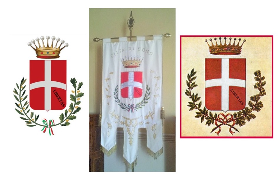
Let’s view the evidence. Seen below are three current versions of the city’s coat of arms. On the left is the version now approved by Rome’s heraldic office. In the middle is the version emblazoned on the city’s official banner. On the right is the version publicised and approved since 2016. I am not proposing a ‘Spot the Difference’ prize for these three similar if not totally identical images yet whatever differences there are could hardly in themselves justify the Mayor’s promise that “one step at a time all the coats of arms on the website and on signs will be brought into line with the correct one“.
However the third element in Como’s semiotic trio, the logo, might give the vital clue to what may be the ‘disturbing element’ within the municipality’s heraldic representations. The city council publishes online some very precise details on the logo’s looks and how it can be represented. The ‘official’ version is shown below on the left next to a version lifted from Wikipedia. Both versions differ markedly from the coat of arms above. So it might be safe to assume it is the logo that is about to be modified and not the coat of arms. Unfortunately it is the logo that gets emblazoned on every rubbish bin across the city including those only recently installed on the newly opened lakefront passeggiata.

None of this is of earth shattering importance albeit, in tackling ‘even the small things’ it may just inspire a sense of potency and ambition within the city’s administration with unexpected consequences. Whatever may be any eventual impact, the immediate result has been to provoke some priceless sarcastic commentary accompanying the media reports in the online paper, ComoZero and the daily La Provincia. Such comments as ‘At least this problem of the coat of arms is fixed. I haven’t been able to sleep serenely for months!’ or ‘Thank God this has been resolved. It’s been years that I have felt uncomfortable looking at our coat of arms without knowing why. Now we are a better city – I feel we finally have an administration prepared to take on vital issues for the community. We have reestablished order, restored harmony..’

Leaving all flippancy aside, there is some value in exploring the design of the coat of arms for those with an interest in history. For example the red background to the shield with the white cross identifies Como as a ‘Ghibelline’ city as opposed to the white background and red cross of ‘Guelph’ cities like Milan. The distinction between Guelph and Ghibelline was a feature throughout Mediaeval Northern and Central Italy with the Ghibellines supporting the claims of the Holy Roman Emperor and the Guelphs supporting the Pope. For Como, the Holy Roman Emperor Federico Barbarossa was nothing less than a saviour who came and liberated them from Milanese oppression following the disastrous outcome of the city’s ten years of warfare with Milan from 1118 to 1127.

The other distinctive element is the motto ‘LIBERTAS’ in the lower right quarter of the shield. This was apparently first added to the coat of arms following Barbarossa’s sacking of Milan and liberation of Como in 1157. The motto then came and went according to the fate of the city through the ages. It was removed during the time of the Visconti’s rule to be reinstated during the short lived period of the Sant Abbondio Republic. It disappeared again under Spanish and then Austrian dominion to finally return following Garibaldi’s liberation of the city in 1859.
Como first earned the right to top its coat of arms with a crown when Francis of Austria granted it the status of a ‘Royal City’ on the 9th November 1819. The design of the crown changed following Garibaldi’s liberation of the city under the flag of the Royal House of Savoy.
One of the main differences between the logo and the coat of arms is in the form and colour of the ‘floral’ embellishments. The coat of arms bears green sprigs of laurel and oak while the logo features a golden metallic design. The golden version was introduced under Austrian rule so as to avoid the combination of green, white and red that could easily be associated with the irridentist tricolour and the struggle for independence. It would seem unusual that the city’s logo maintained such an unpatriotic feature for so long. And so perhaps the mayor’s intervention is not such a small matter after all!
Further Reading
For more information about Como’s 10 year war with Milan and the support of Federico Barbarossa, read Isola Comacina – A Serene Location with a Tragic Past
For a gallop through the history of the city, read Como’s City Walls


